How colors print differently on the various Spoonflower fabrics
As some of you may know, some of my fabric designs are available on Spoonflower – the link to my designs there is this one.
Now, for many of my fabrics I suggest something like „the colors will look best on this or that fabric“.
Many people fail to understand what I mean – color is color, right?
Wrong.
That’s why I’ve invested a few bucks to get swatches of quite a few of the fabric types that Spoonflower offers to be able to illustrate how the colors are printed on those fabrics.
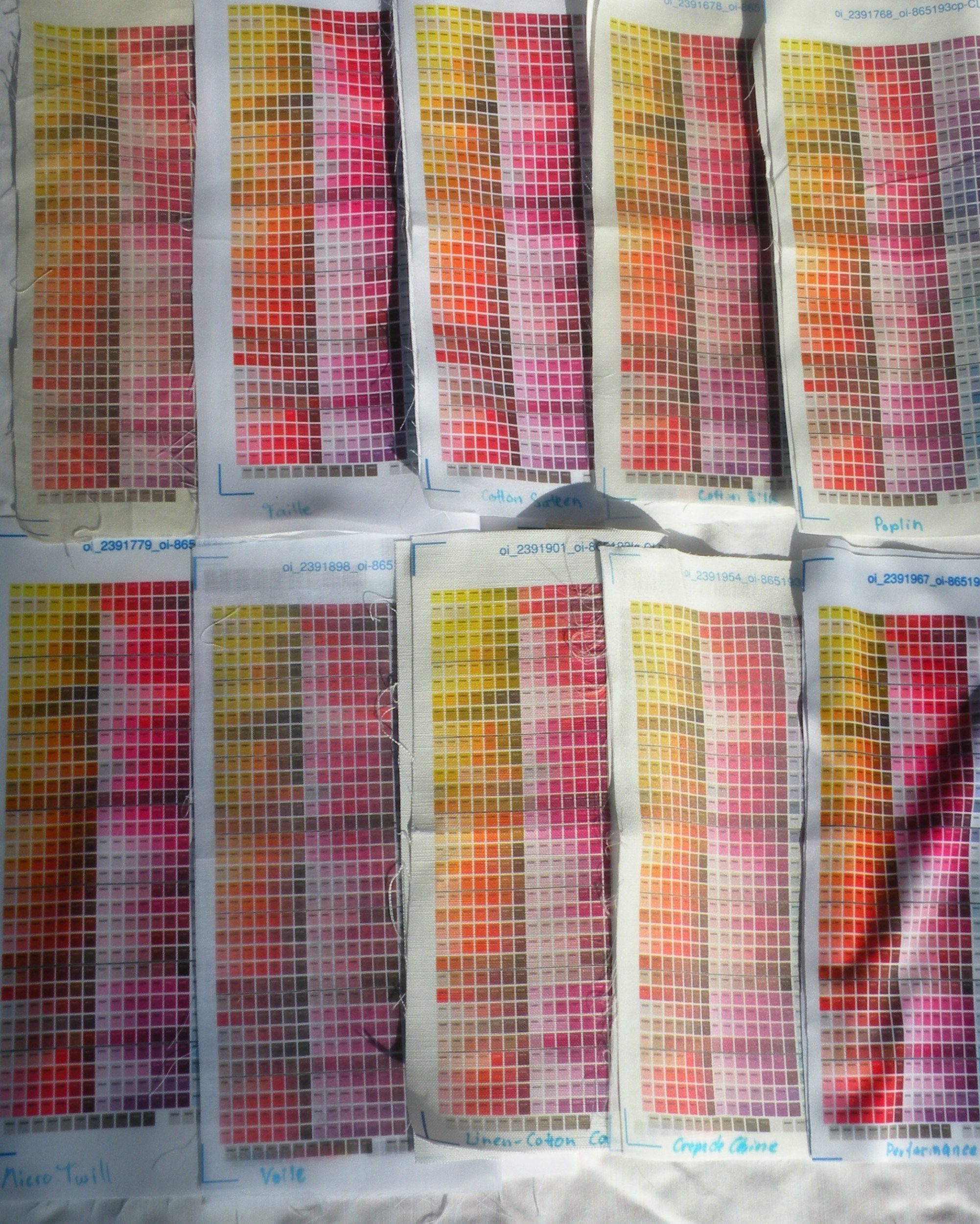
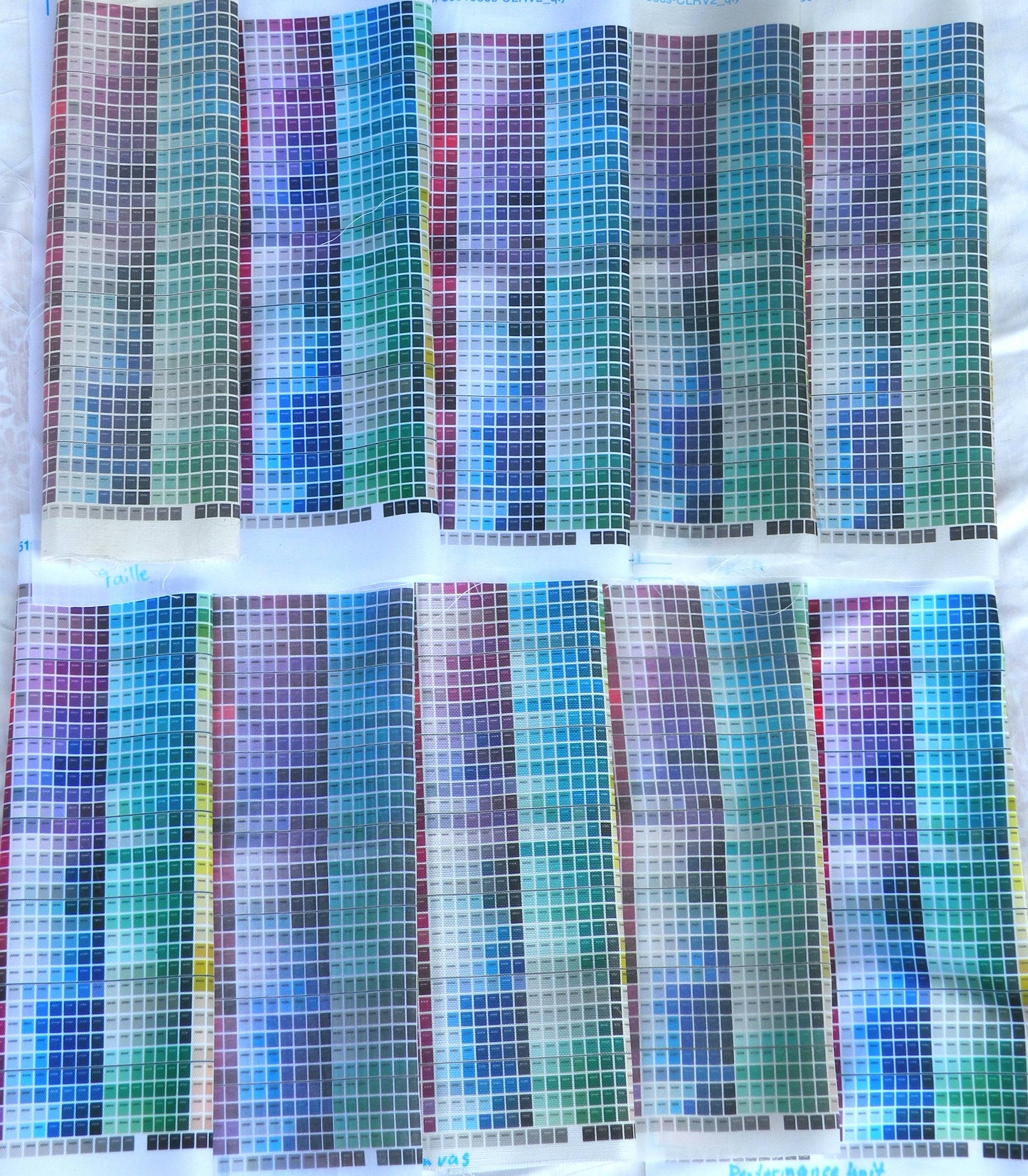
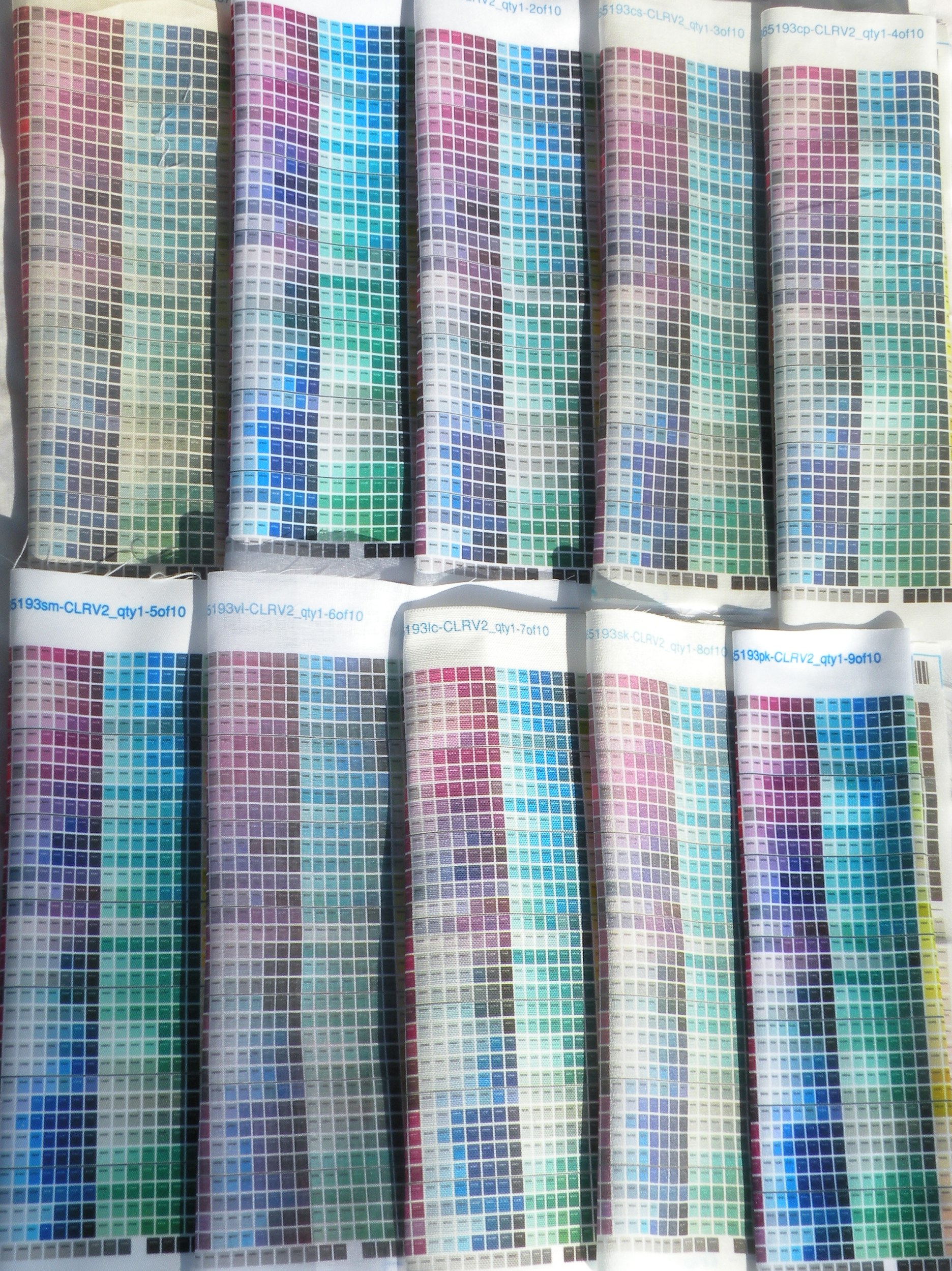
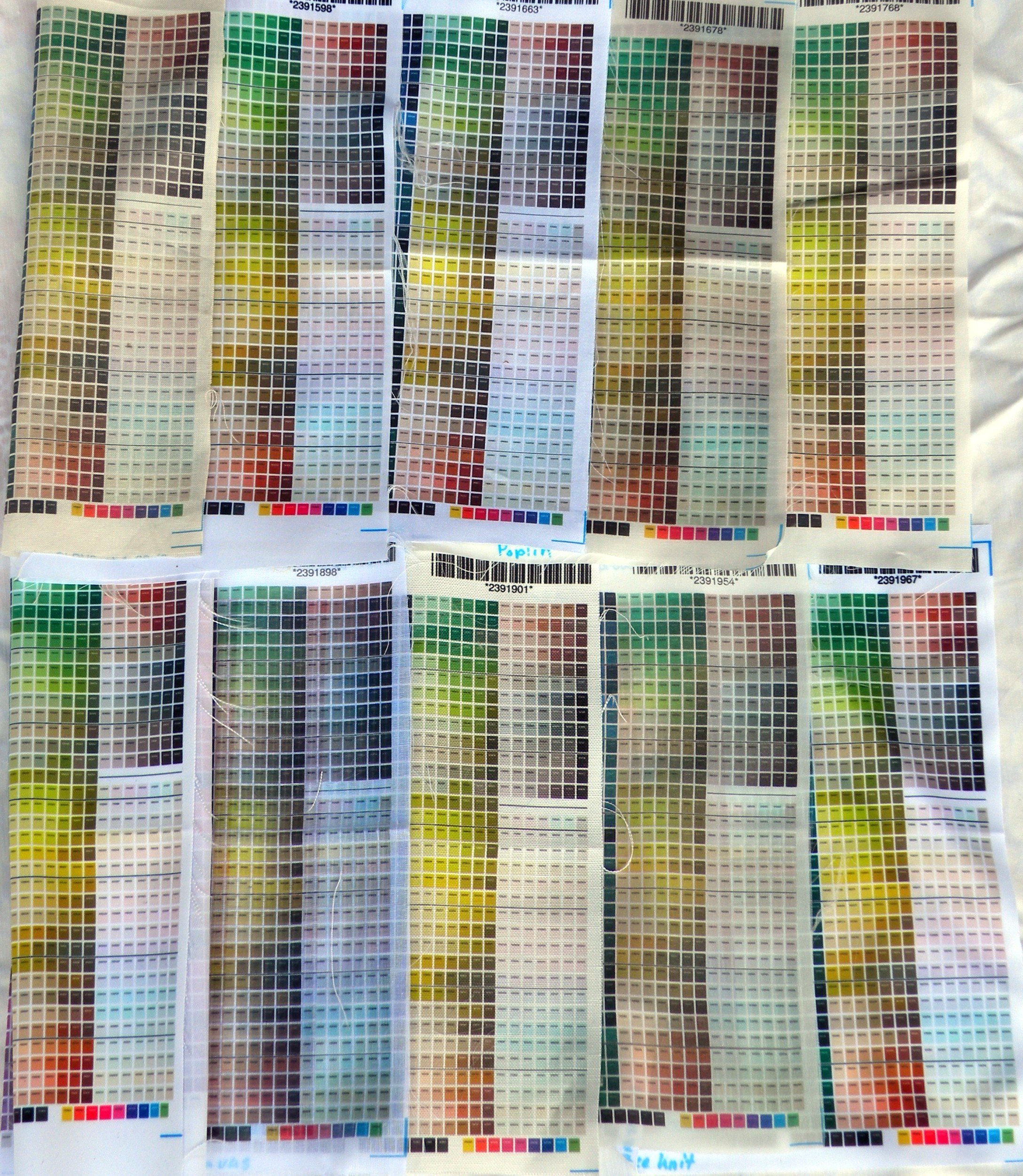
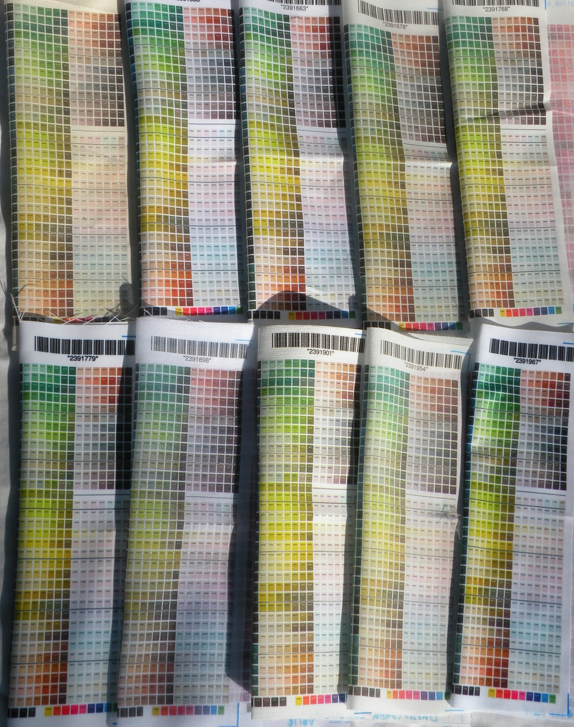
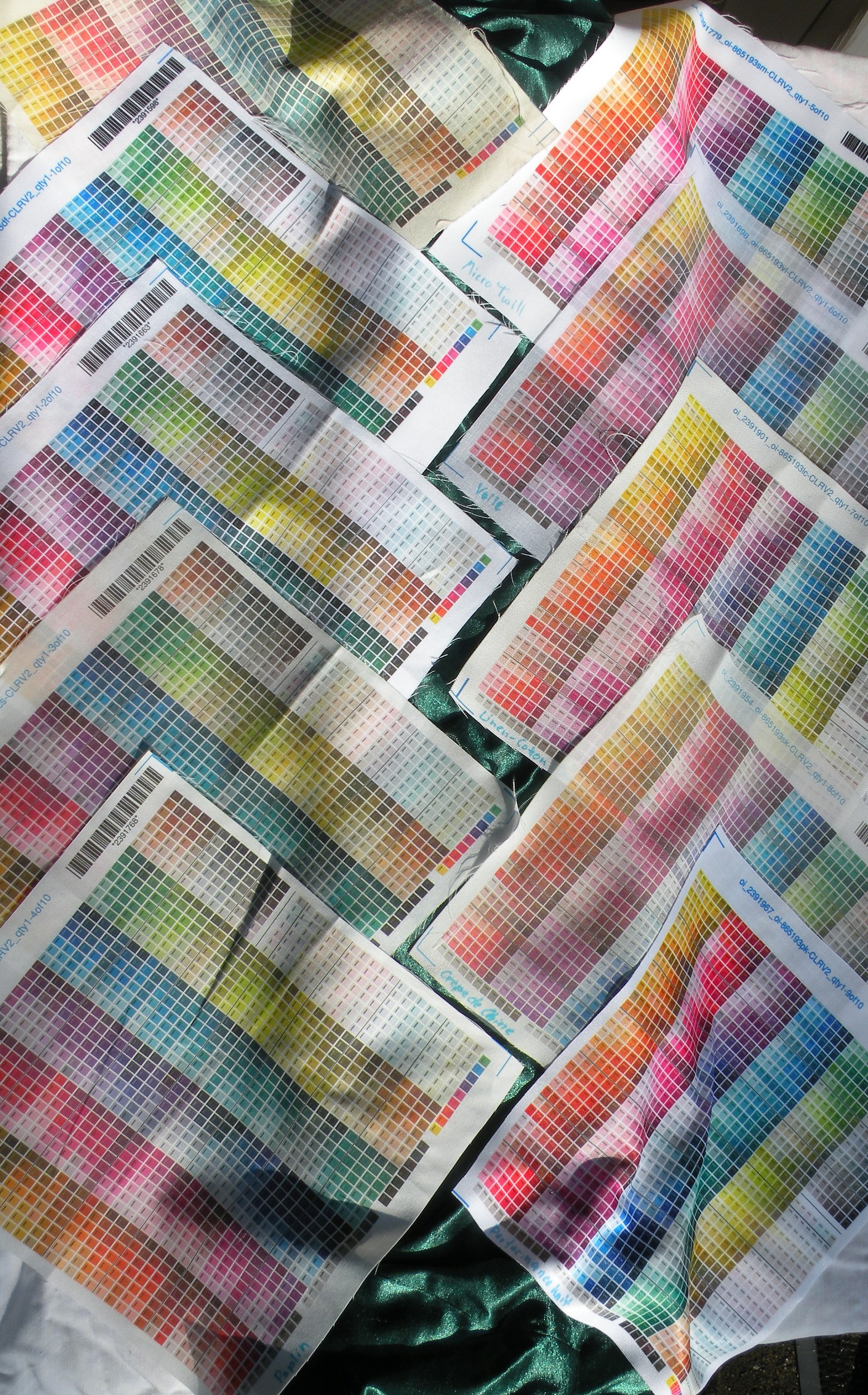
Just for the records, the design that I used for the swatches is a swatch-sized version of this Spoonflower color map.
Just so you know which fabrics I have swatched, these are:
- Basic Combed Cotton
- Dress-Weight Faille (may not be available to the public yet – the advantage of being a Spoonflower designer and able to test fabrics…)
- Organic Cotton Sateen
- Cotton Silk
- Cotton Poplin
- Micro Twill (may not be available to the public yet)
- Cotton Voile
- Linen-Cotton Canvas
- Silk Crepe de Chine
- Performance Knit
The numbers listed for the fabrics above (1-10) are the numbers by which I will refer to them when explaining what you see in the photos below.
As for the widths, weight, prices of those fabrics – please refer to this Spoonflower help page.
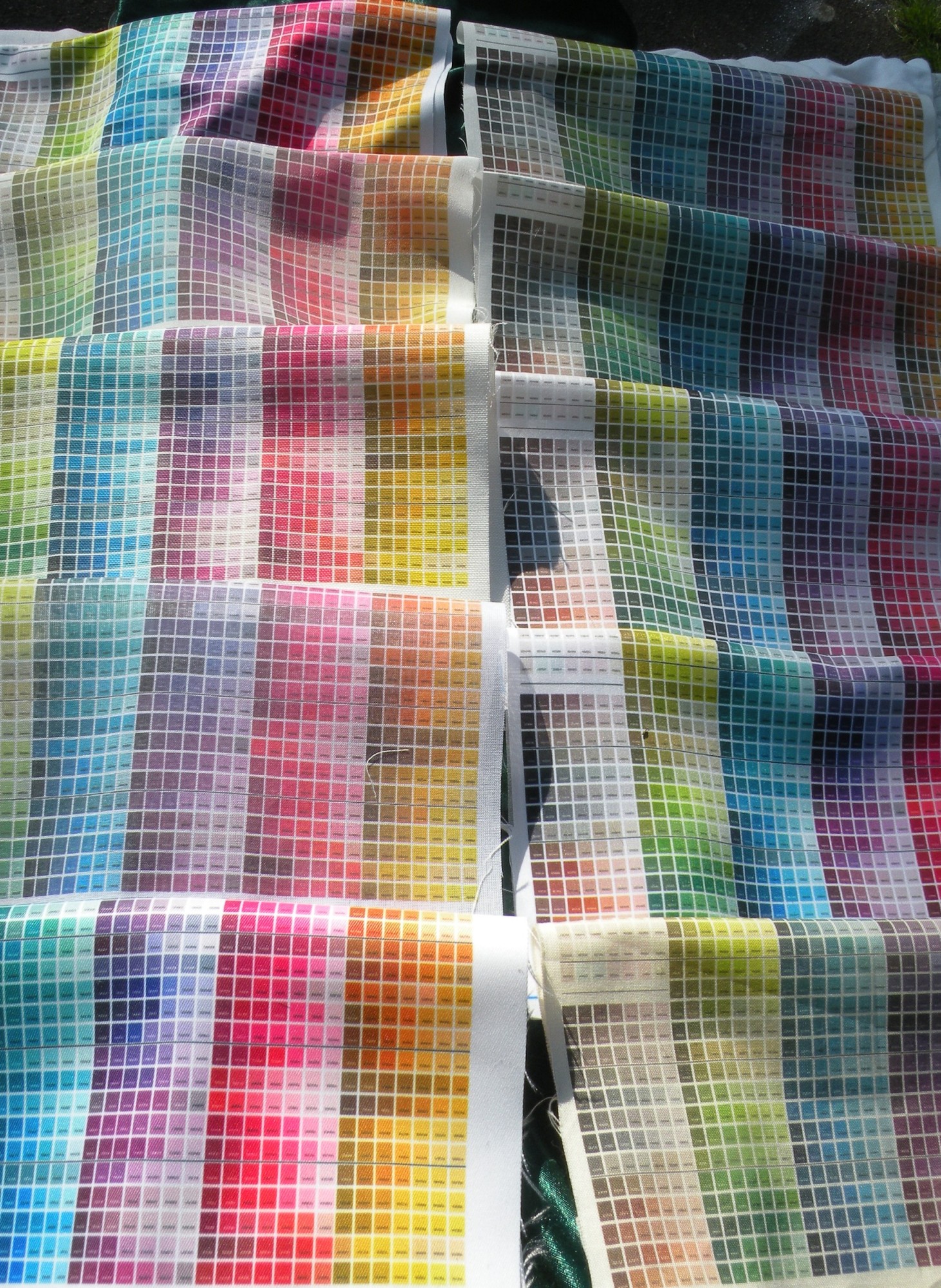
Let’s start with an overview of all the fabrics.
 |
 |
| Left: Picture taken in shade; right: Picture taken in sunlight. Top row; left to right: 1-5; Bottom row; left to right: 6-10. |
|
Now, as you can probably see, there are three fabrics which stand out in terms of color brightness – those are 2, 6 and 10; directly followed by 4.
That’s because 2, 4 and 6 are polyester fabrics; while all other fabrics are either cotton or cotton / silk or cotton / linen blends (or pure silk – 9, to be precise).
On the recently introduced polyester fabrics, the colors DO appear more vibrant and brighter. That’s not the fault of the printer – it’s just the way how the printing inks look on natural vs. polyester fibers.
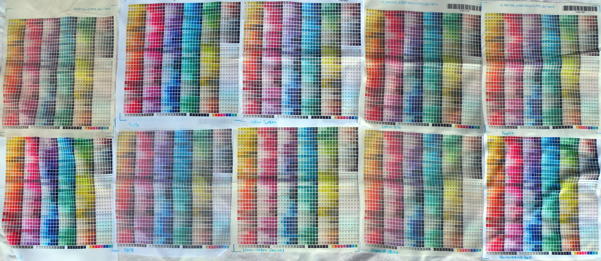
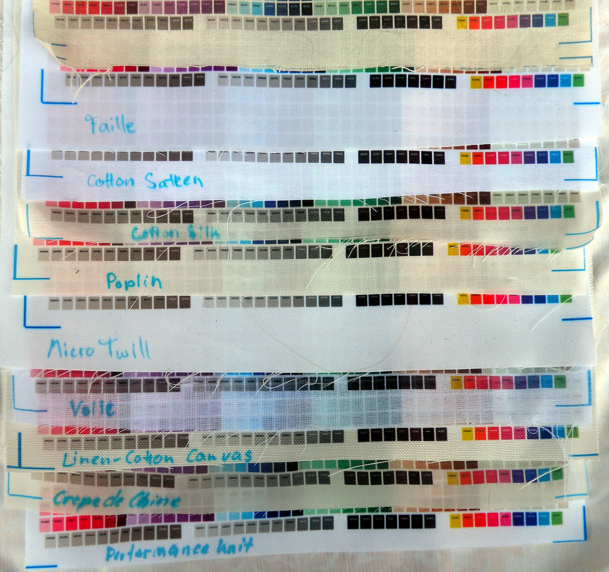
But let’s go into detail and have a look at the colors up close:
 |
 |
 |
 |
 |
 |
 |
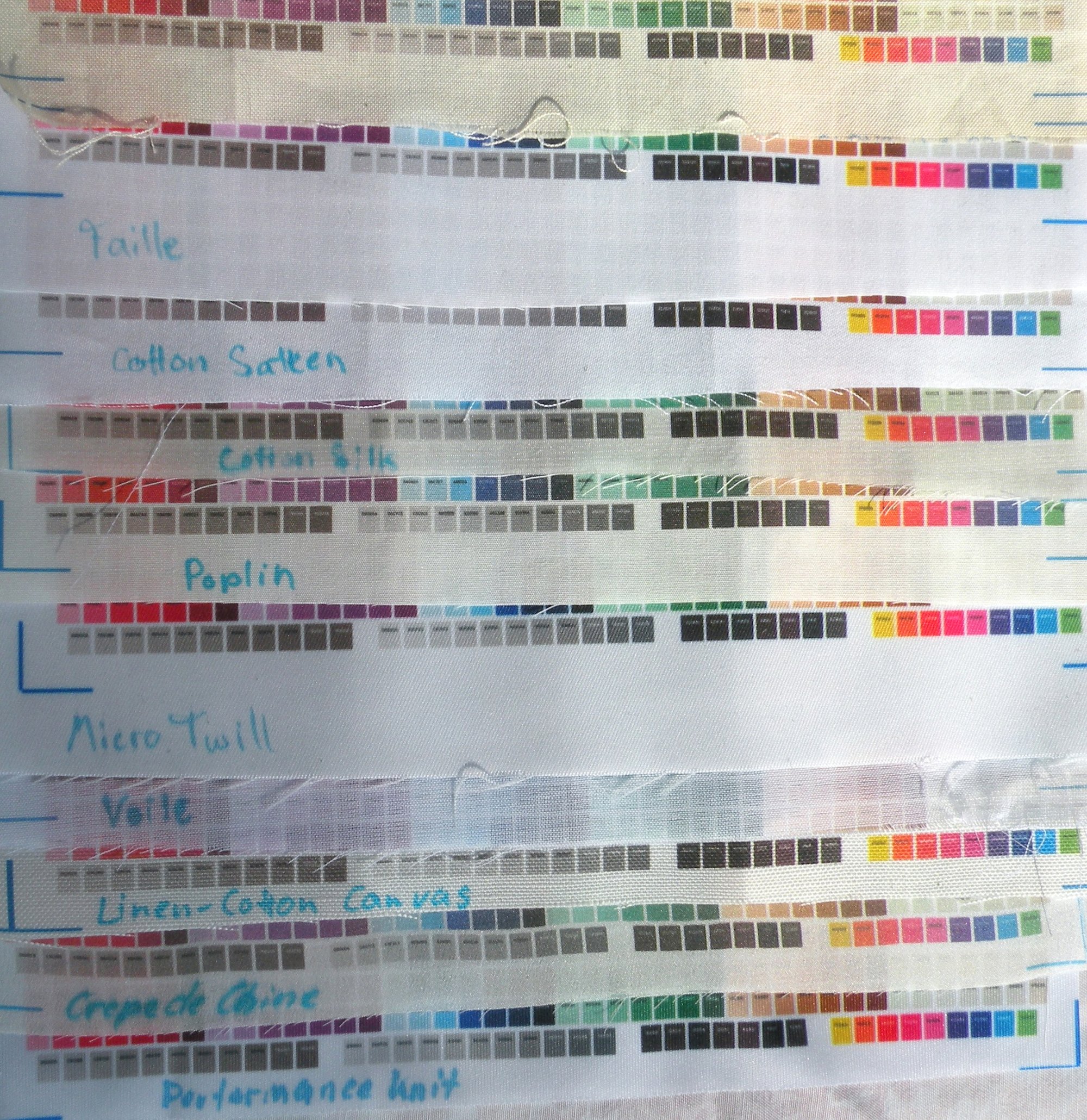 |
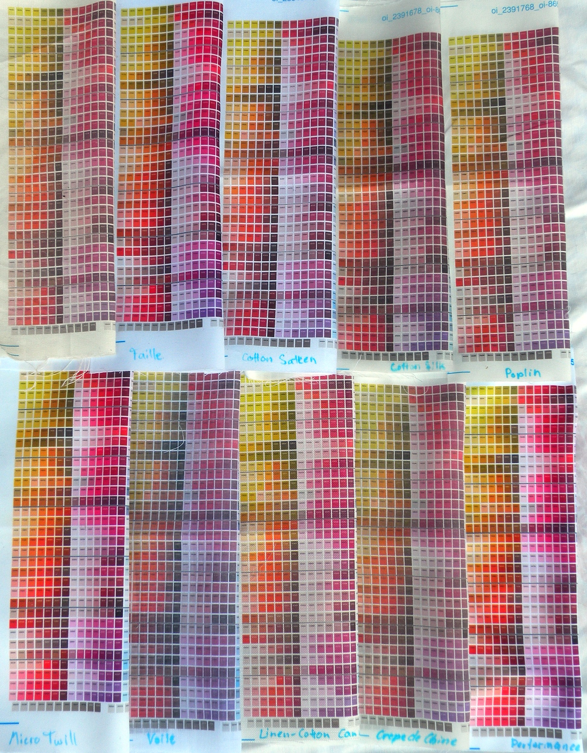
| Again, for each picture save the last two: Left: Picture taken in shade; right: Picture taken in sunlight. Top row; left to right: 1-5; Bottom row; left to right: 6-10. Last picture shows fabrics 1-10 from top to bottom.I particularly recommend comparing the RED shades of the various fabrics in the very first picture. It’s almost as if the natural fabrics which do not print as vibrant as the polyesters have been washed out; but that is not the case. Also notable is how much better the blacks are printed on the polyester fabrics. |
|
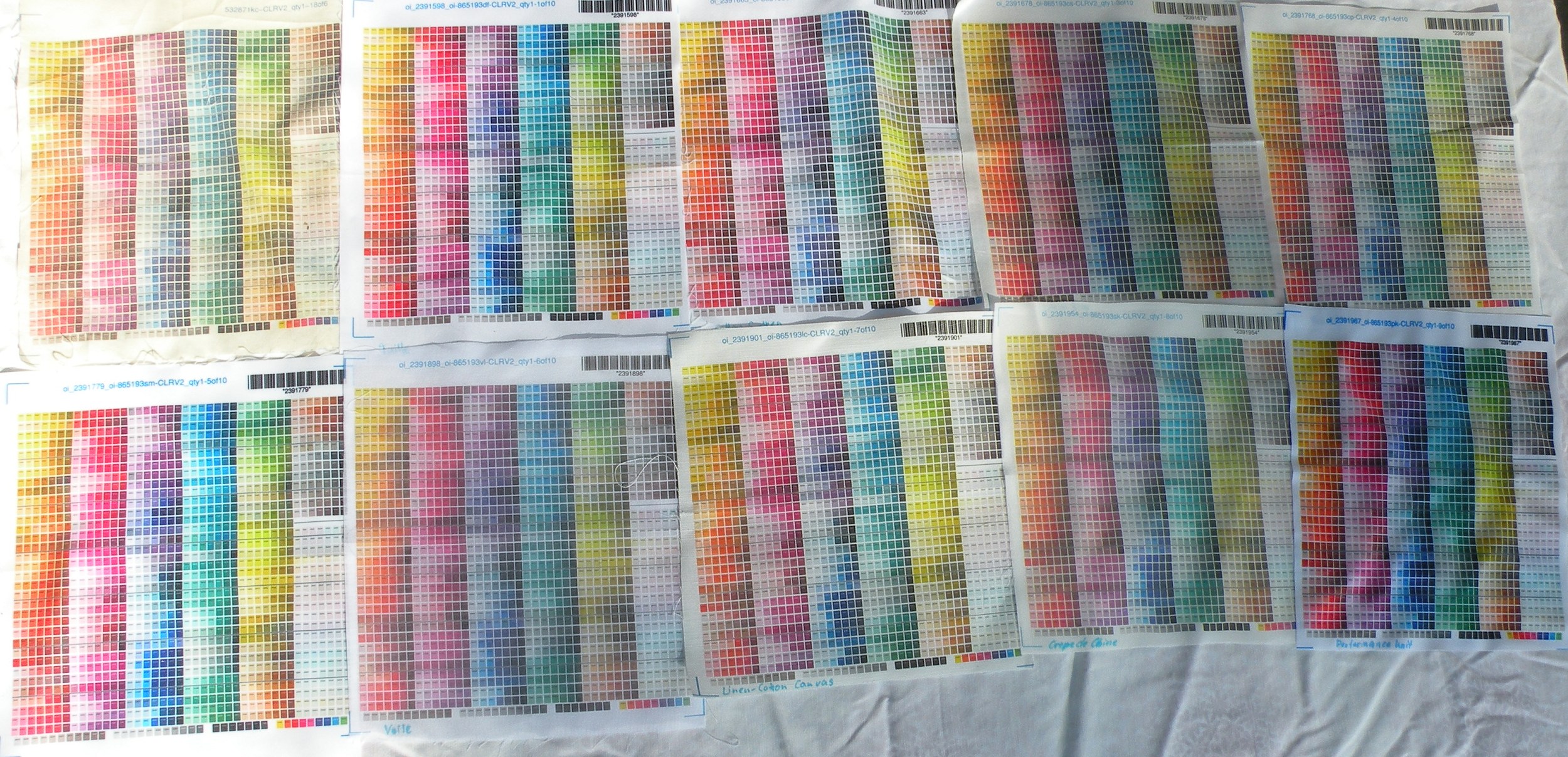
Another set of pictures – this time comparing the sheerness of the fabrics:
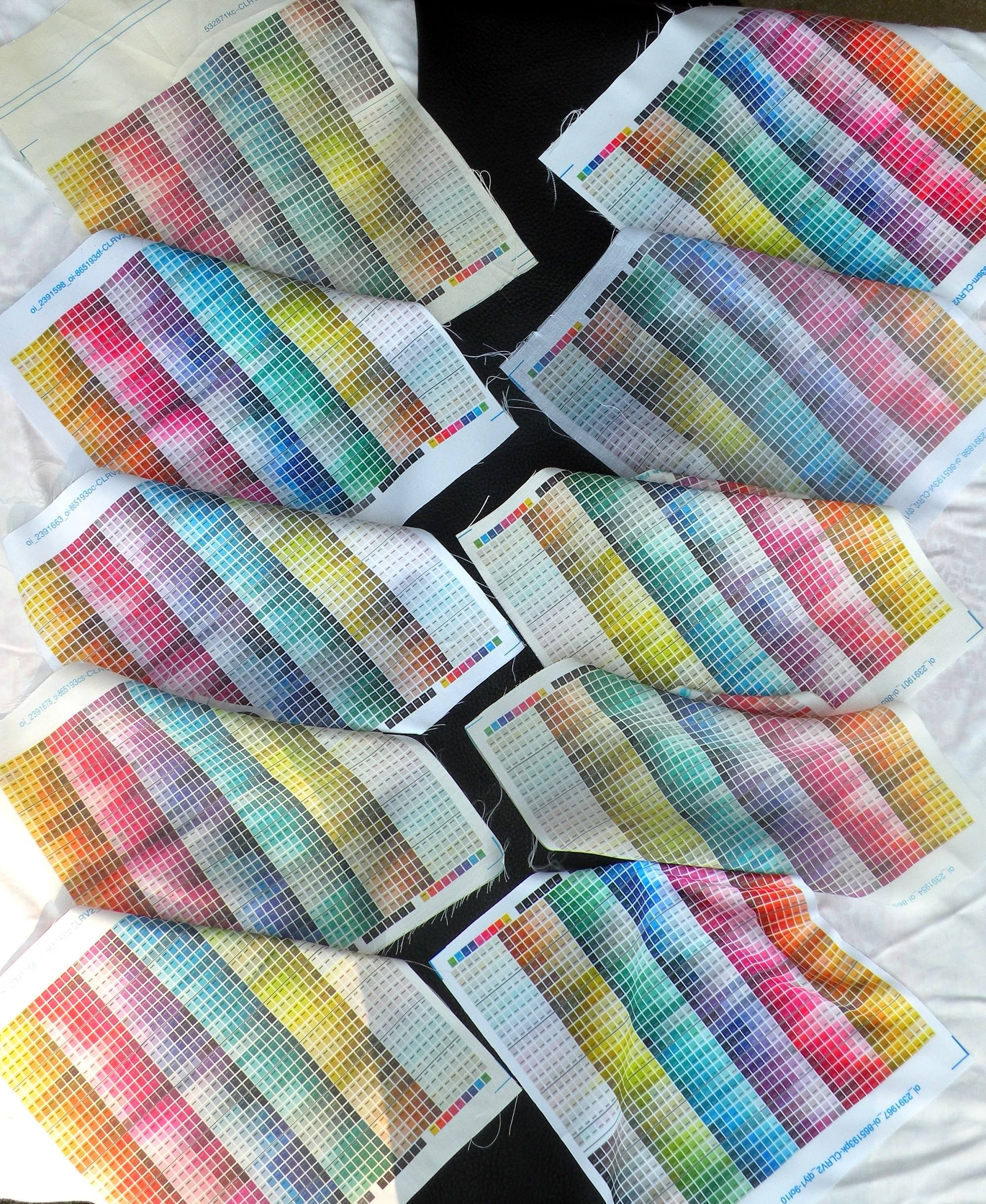 |
 |
| Almost the usual setup – left, shade; right, sun; left rows top to bottom: 1-5; right rows: 6-10. For the left picture I placed a piece of black leather beneath the fabrics at the center; for the right one, a piece of green satin. You will notice how the fabrics 7 and 9 are the ones that are most sheer. |
|
Now, what does this examination conclude to?
First, it is entirely up to you which fabric you chose for a project. Some may not be suitable for certain projects; i. e. it’s rather difficult to make one of the „big“ dresses, like my Travel dress, using a stretch fabric (which is why I chose the Organic Cotton Sateen for that one – this was before the introduction of the polyester fabrics; now I would chose Silky Faille, which became my new favorite).
Also, if you, like me, strongly dislike Polyester fabrics, you want to pick either the Organic Cotton Sateen or the Cotton Poplin since those two – from the range of natural fabrics – DO print the colors best. Again, I have changed my opinion in particular about the Silky Faille (which IS polyester!) after it had been introduced.
Another option is the Cotton Silk, but since that fabric has a sheen that is rather similar to dupioni silk, it may not be suitable for projects that require more matte fabrics – however it of course IS brilliant for projects that DO require that kind of sheen.
The linen-cotton canvas is a good option if you need a REALLY sturdy fabric (i. e. for bags).
And the Silk Crepe de Chine, well, it doesn’t print the colors so very well and is a tad on the sheer side, but still, it’s pure silk and very airy.
If you REALLY want bright and clear colors, I do NOT recommend the Basic Combed Cotton or Kona (the latter not pictured in my swatches but yielding a similar result to the Basic Cotton).
Yes, I know, it’s the cheapest option.
I have seen MANY people complain that the colors turned out way less vibrant than they expected them to be on the cheaper cotton fabrics, presuming that Spoonflower either did a faulty printing or that Spoonflower prints, in general, aren’t worth the money.
That’s just wrong – as usual, „you get what you paid for“ – and if you pay for the cheapest possible option, don’t expect the colors to be as vibrant as on one of the more expensive fabrics.
At any rate, I DO strongly recommend ordering swatches (of possibly more than one fabric type!) if you like a certain design. That is the only way you can find out how the colors do actually print on certain fabrics.
Hope you found this little Spoonflower color guide printing comprehensive 🙂
Hi There
I love your designs and the detail you provide!
A few questions – I’d like to make the Audrey Sabrina dress – but ideally using another base colour than white.
– which fabric would you recommend for this dress?
– do you provide the design on other colours or can the fabirc you recommend be dyed (looking to go gold/warm cream)
I look forward to hearing from you asap
Many thanks in advance
The page with the chasing butterflies wallpaper has one pic with a really vibrant, saturated wall, and another pic of rather muted colors on the wallpaper. Which is it? Thx.
I just ordered my first swatches from Spoonflower a week ago and wish I would have come across your article first! I made the rookie mistake of getting them printed on the cheapest cotton, not realizing they probably won’t come out as vibrant as other fabrics. (I LIVE for vibrant colours!!). Your article has been most helpful!! Next time I’ll know better! 🙂
Micro twill not the same as the cotton twill? Would this work?
The Micro Twill was polyester, and was never released because it was apparently rather difficult to print it. So no, that was not the same as cotton twill.
Maybe you should order one of Spoonflower’s little swatch books so you can touch and feel the fabrics before buying any. The swatch book can be found here at the bottom of the page.
Hi there, my husband and I are going to order some fabric to make a custom comforter for our son. We will be attaching the fabric to an existing black comforter most likely the micro feel polyester. So we need a crisp black to print in the design. Which would you suggest a silky faille or cotton poplin? Thank you for this experiment it was helpful.
Black will print better on the polyester fabrics than on the cottons.
However, depending on the age of your son, I would always recommend one of the cotton fabrics.
Polyester doesn’t absorb moisture too well while cotton does; and this is something you really want for anything used in a bed since people sweat at night, and that moisture has to go somewhere.
Also, cotton is literally more breathable which means in case you ever have the choice of having a cotton or polyester comforter accidentally pulled over your head, you should definitely choose the cotton one since the chances that you will survive are much higher – this is why I mentioned the age of your son.
Cotton, of course, comes with a catch. At least for the printed Spoonflower fabrics, it’s true that the colors rub off during the washing much faster on the cotton fabrics than on the polyester fabrics.
By „rubs off“ I mean that when the fabric is in the washing machine, it will rub against itself and against the walls of the washing machine. When that happens, the print will rub off in places on the fabric. This is not the usual „fading“ during the washing; it’s really printing ink that rubs off.
Particularly on dark printing colors, this is VERY noticeable already after the first washing. It basically looks like lighter creases in the fabric.
So when you need a „crisp black“ on cotton and ever need to wash that fabric, keep in mind that it will hold that printing color only until that first washing cycle – the hotter the washing cycle, the more obvious the rubbing.
Of course you could decide to always have the comforter dry cleaned, in which case the printed colors would probably remain crisp and „not rubbed off“ much longer.
You see, both polyester and cotton have their advantages and disadvantages – polyester has the more crisp colors which last longer; cotton is more breathable and absorbs moisture better.
Since I (again, that’s just a personal thing) use pure, natural linen fabrics for everything that’s in my bed as that fiber absorbs moisture best and makes me feel most comfortable, I cannot wholeheartedly recommend either of Spoonflower’s polyester or cotton fabrics for anything bed-related. I eventually learned that comfort is more important than colors or prints when it comes to my sleep 😉
Hi, my belly dance troupe is in search of butterfly fabric. We are doing a performance and during it we will „turn into butterflies“ each one of us will be a different color. Is there anyway to order swatches of your larger butterfly fabric? I saw mention of ordering swatches, but didn’t see where to do it.
Thanks,
Jovana
You can select „swatch size“ from the dropdown field on the fabric page on Spoonflower. That is how to order swatches.
However, for that design, because it’s so large, I recommend ordering a swatch of the „Butterfly Invasion“ fabric since it shows the entire wing, not just a tiny fraction of it.
Hope that helps!